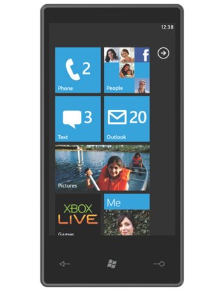
Today Microsoft unveiled the new Windows Phone 7 Series. Now normally, the whole idea of Windows Mobile brings little excitement or interest. However, in this case we finally have something worth taking a look at. The new Windows Phone 7 Series does away with everything you knew about the old and tired Windows Mobile. The new interface is stripped down to the basics and mixes simplicity with clean typography and is something completely different, yet reminiscent of the Zune HD. The buttons of the home screen are simple and different than anything we have seen before. Unlike the iPhone there are no rounded buttons with drop shadows. Instead we have simple square contextual buttons with notifiers of just an icon and number. The menus are elegant and slide vertically as opposed to horizontally like everyone else does it. Aside from the home screen you have access to Xbox Live, Email, chat, and office. The photos allow for pinch and zoom multi-touch and work as well as the Zune HD.
The hardware is completely the non-issue here. We can only assume they have taken somewhat of a minimalist design queue from Apple and try and move everything out of the way except the interface. While manufacturers will be free to create hardware and modify the home screen to their needs, Microsoft is holding the reigns more tightly this time. They will require specific specs in order to better benefit the user with a fluid user experience.
Aside from this we don’t have a whole lot more information, but you can expect the phones out sometime around the 2010 Holiday season or just in time to get one for Christmas.
UPDATE: Microsoft has released a video overview of the new Windows Phone at [MSDN]
[nggallery id=1]

